Insights to Help you Understand your Visual Content
New features for evaluating image recognition models in the Ximilar App platform. Confusion matrix, failed images and fancy charts included!


This update is huge! Even though this summer in Europe is really hot, we are working hard to improve Vize to become a tool that helps you understand and improve the results much more than any other similar platform.
As we promised you in the previous update of Ximilar App, here are new features that would save you time and lower your stress levels significantly.
More Tools for Developers
Vize users are asking all the time for tools to help them inspect and debug their classifiers. As machine learning experts, we know how hard it can sometimes be to build a reliable model. It is a tough challenge even for professionals. Our goal is to make Vize as simple as possible. Yet we are still focused on you, using our API and developing tools on your side.
So, now you can look and examine your Tasks and Models even deeper. We have added Model Screen, where you can find four tools helping you to improve your classifiers. We have used these tools in our custom machine-learning solutions for our customers to help ourselves. And we believe you will love it as much as we do. To see the features, click on the Detail button in the list of models on the Task Screen.
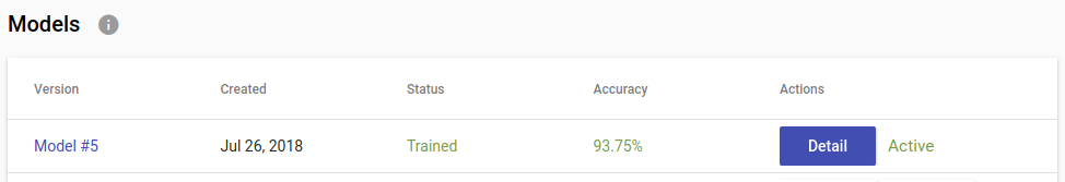
Insights can be accessed via the Detail button
Confusion Matrix
The Confusion Matrix is a well-known visualisation technique to help you understand which labels are commonly mixed up (confused.) Imagine that we want to build an Animal Classifier with four labels cat, dog, parrot and bird (various other kinds.) Probably, cats will likely be confused with dogs and parrots will more likely be mixed up with birds. This is a very simple example, but in a more complex scenario, this chart will help you pinpoint exactly the most interfering labels.
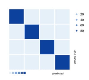
Confusion Matrix with 4 Images
The value of each square represents a percentage of how many pictures belong to ground truth label — rows, or was classified as predicted label — columns. The higher the percentage, the darker the colour.
Ideal Confusion Matrix has all diagonal squares from top left to bottom right dark — high percentage and all other squares light — low percentage. Vize computes the Confusion Matrix on a testing set, which is approx. 20 % of all images in the Task.
Failed Images
Another feature to help you understand what is happening inside your Task is knowledge of failed images. Vize will show you some of the images that your classifier misclassified — behaved incorrectly after training. You can clearly see, with such an overview, that some images can be quite hard, and maybe your Task needs more similar images to be added to some labels.
Vize computes misclassified images after final training (training & test set) on all of your data. That is also why Confusion Matrix and Failed Images could differ. Thanks to Failed Images your classifier is going to be more transparent and you will know better how to tweak the Task to get better results.
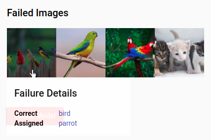
Dialogue with information for each image
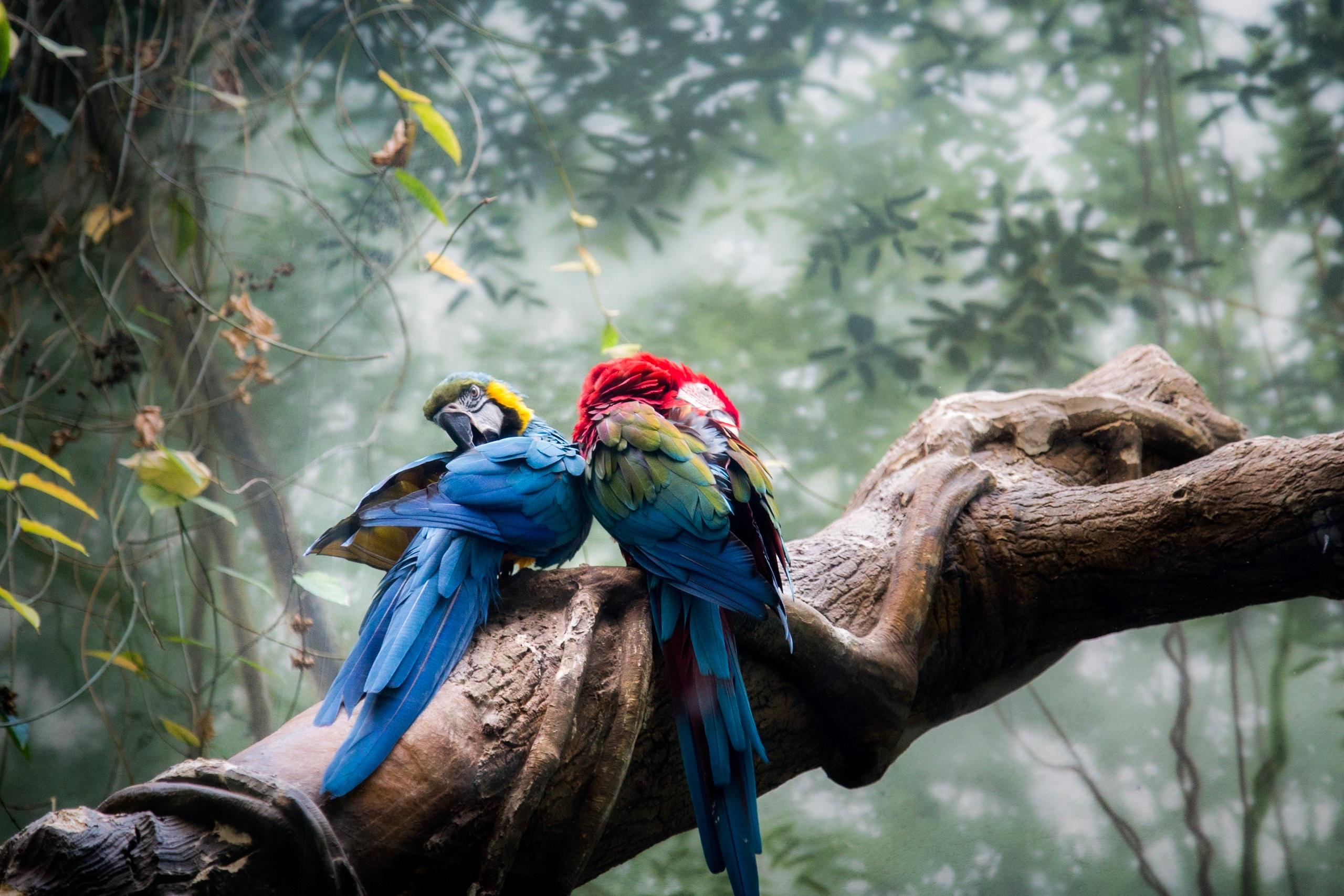
In this example picture, our Animal classifier has failed on some images. The first picture should be classified as a bird, but our model predicts that it is a parrot. We can see that indeed the first picture is a bit more colourful, probably that is why our model made an error and classified the image as a parrot. Another possible explanation could be, that some birds have many features in common with parrots. We have overfitted our small task, and we need to put a bit more similar images to our dataset.
More Charts
Quite commonly, user tasks have several labels, and it could be difficult to see that they have imbalanced data. That means the number of images for some Labels can be higher than for all other Labels, or one of the Labels has only a small percentage of images and all other labels are quite well-defined.
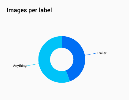
Anything has a little more images than a Trailer
Our optimisation algorithm can handle this quite well, but we still recommend you balance your data so you will get the best results.
Uploading more images just to some Labels can lead to decreasing overall accuracy of the classifier, however, with more images overall, your classifier will have more stable results throughout all Labels. We recommend always having some data prepared which will never be uploaded to Vize and on which you can test your models. Check out the Images per Label section, with a pie chart, where you see how well-balanced your dataset is.

Tags & Themes
Related Articles
How to Automate Pricing of Cards & Comics via API
A step-by-step guide on how to easily get pricing data for databases of collectibles, such as comic books, manga, trading card games & sports cards.
Getting Started with Ximilar App: Plan Setup & API Access
Ximilar App is a way to access computer vision solutions without coding and to gain your own authentication key to use them via API.
Get an AI-Powered Trading Card Price Checker via API
Our AI price guide can be used for value tracking of cards and comic books, offering accurate pricing data and their history.